(optimised for desktop).


19 November 2025, 6.30am - 8.30pm,
6-24 Britannia Street, London
Unit Editions: an evening about books, featuring Chris Ashworth, Sean Perkins and Charlotte Lengersdorf in discussion with Unit Editions' Adrian Shaughnessy. I will discuss a forthcoming title devoted to asemic writing and new trends in abstract typography. Picture by Adrian Shaughnessy.


5 November 2025, 9.00am - 5.00pm,
Campus Fonderie de l’Image, 81-83 avenue Gallieni, 93170 Bagnolet, France
Happy to have been invited to speak about 'Typing Choreographies' at this year's Fonts and Faces symposium. Organised at the Campus Fonderie de l’Image, the symposium examines the production of new lettering models. We propose to question what drives type designers to renew existing models. We will address issues such as the tensions between the production of new forms and their expressiveness, between the rejection of conventions and legibility, and between new experiences and typographical opacity. Organisation and poster by Simon Renaud.


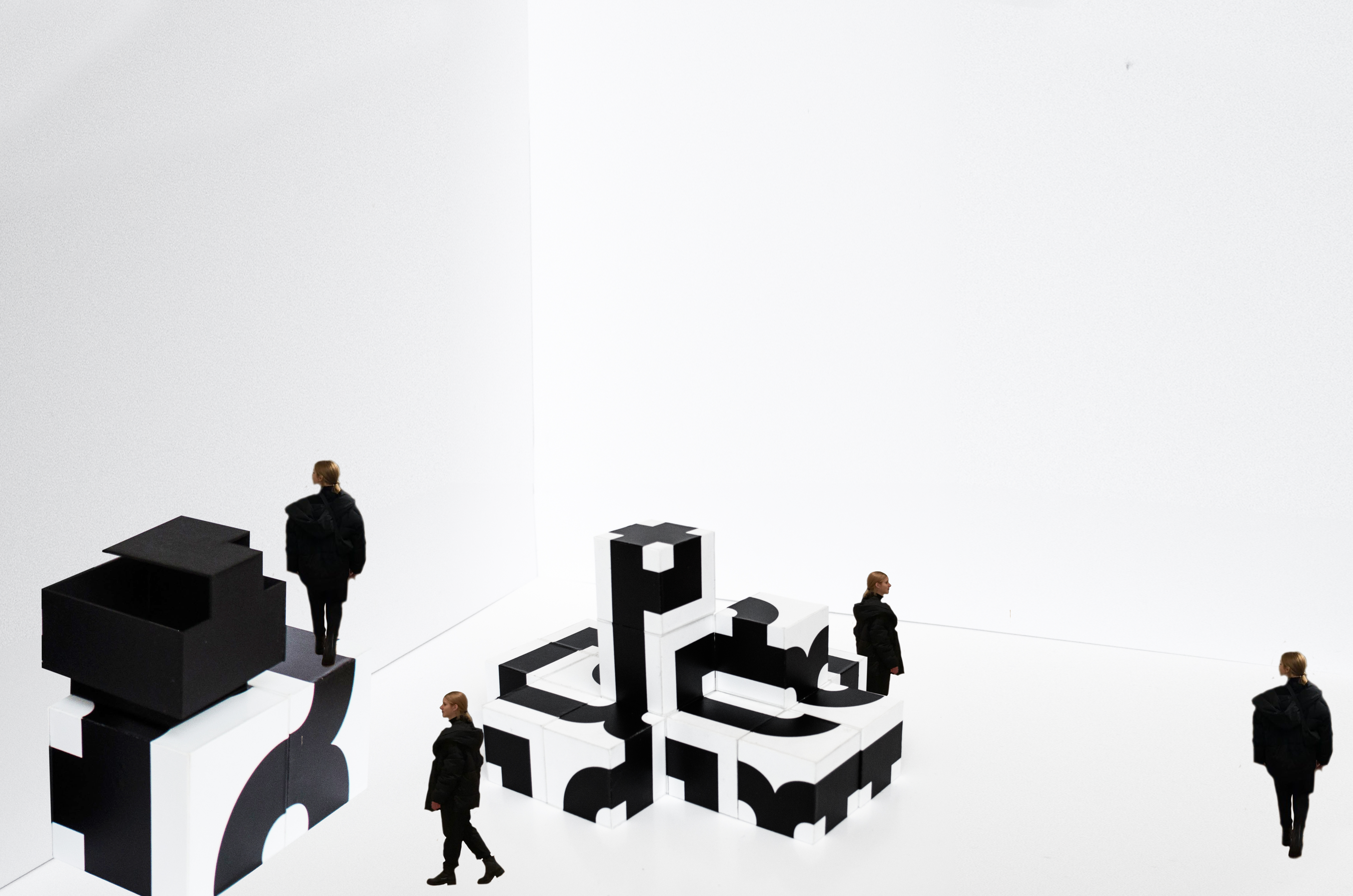
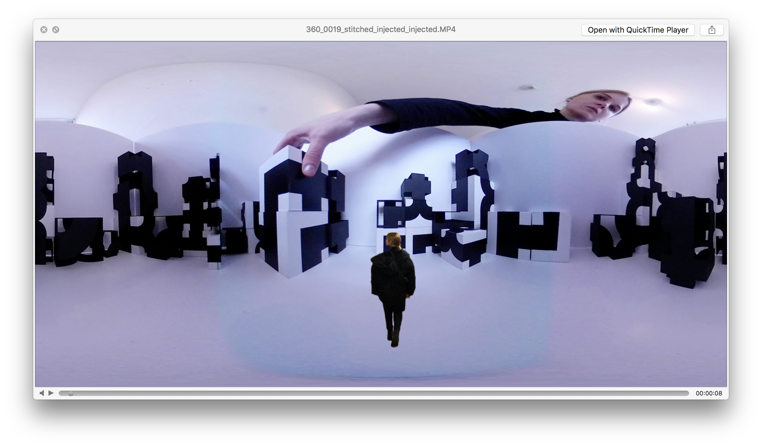
At Choreographic Coding Lab (CCL #19) with Motion Bank, Tanzforschungszentrum, Hochschule Mainz, September 2025.
Dancer Simon Berthoud. Pictures by Florian Jenett.
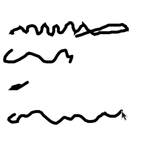
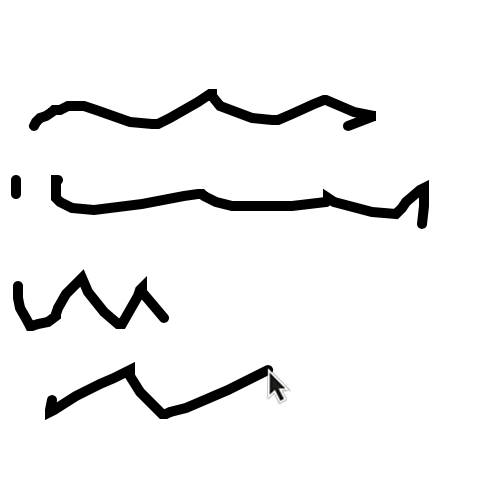
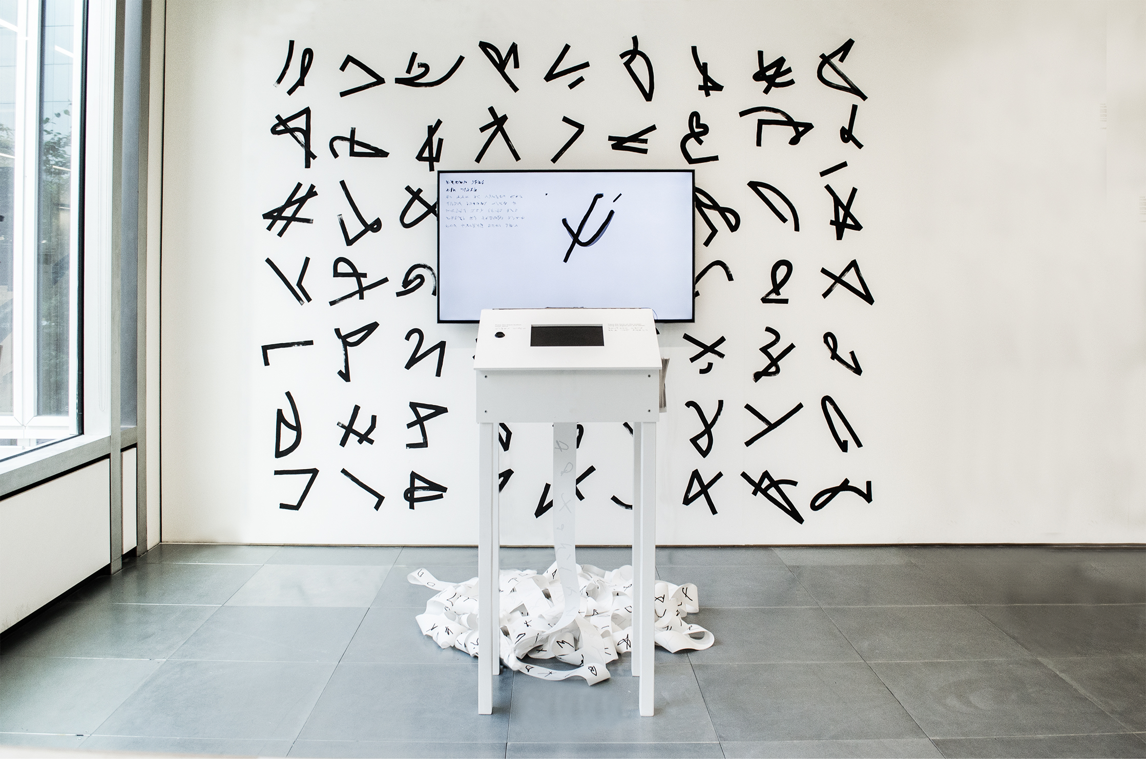
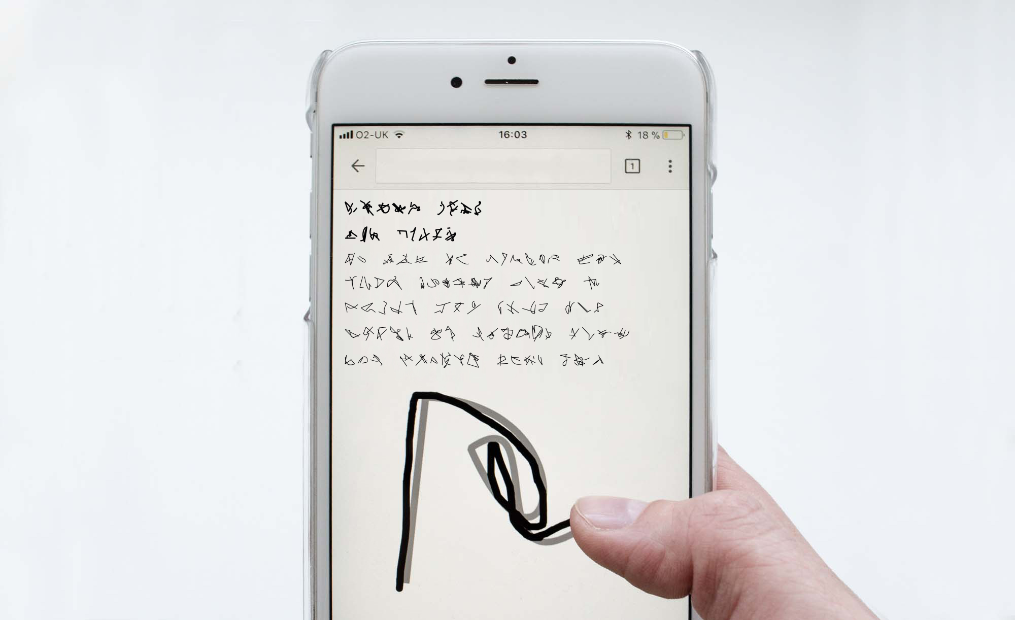
‘Rewriting Interface’ shifts the focus from writing as production to writing as process. While the keyboard is conventionally a passive input device that predictably generates predefined letterforms on the computer screen, this experimental writing programme reimagines the keyboard as a space for discovery and experimentation.
The programme was created and presented for 'Pseudo-Scripts: (Il)legibility and Ornamentation', Italy, as part of my paper'Writing at the Interface: Rethinking Interaction through Asemic Writing' at Pseudo-Scripts conference in Pisa, exploring pseudo-scripts, ornaments and their (il) legibility from broad, interdisciplinary and transcultural perspectives.
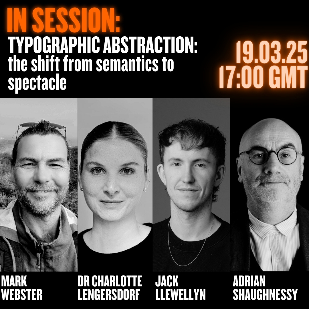
Typographic Abstraction: the shift from semantics to spectacle
19 March 2025 5.00-6.00pm, Online
Traditionally described as the way language is made visible, typography has evolved from this long-established role into numerous abstract, semi-abstract and non-linguistic forms. In a world where emojis and symbols have usurped the role of typography, and where letterforms shape perception and influence how messages are felt as much as read, typography is untethering itself from the need to only convey meaning.
Hosted by RCA tutor Adrian Shaughnessy, this session interrogates the work of three practitioners: Dr Charlotte Lengersdorf, Mark Webster and Jack Llewellyn, who are, in different and highly individualistic ways, shifting typography into a post-semantic realm of visual expression.


Presenting my paper 'Writing at the Interface: Rethinking Interaction through Asemic Writing' at Pseudo-Scripts conference in Pisa, exploring pseudo-scripts, ornaments and their (il) legibility from broad, interdisciplinary and transcultural perspectives.


This issue of ECHO confronts a turning point: the moment in which the interface ceases to be an apparently silent conduit between human and machine and instead becomes a medium of friction, transformation, and play. The ubiquitous "blinking cursor"—emblematic of both the command-line past and the chat-based present—belies a deeper continuity: that our interactivity with computation is increasingly constrained by linearity, by transcriptionism, by the illusion of seamlessness. Editors: Roberto Alonso Trillo and Marek Poliks.
My contribution 'inter-interaction: Choreographing the Space of the Magic Orb' enxtends the metaphor by returning us to the baroque absurdity of Rube Goldberg machines—interfaces that delight precisely because they foreground their inefficiency. If today's AI interfaces mystify the process behind layers of shimmering UX, the paper insists on making the "inter" legible again—choreographing the gap rather than sealing it shut.
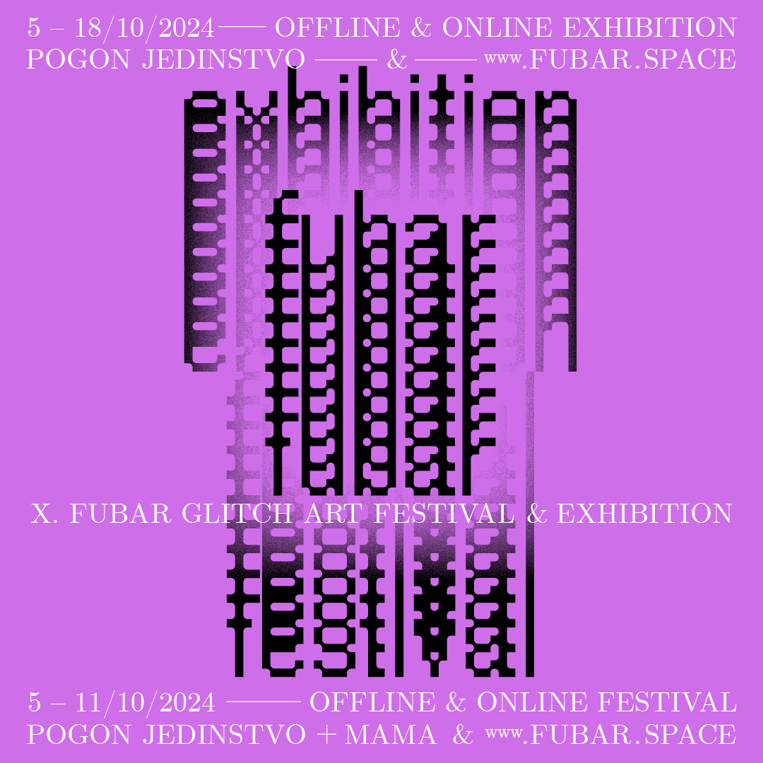
Fubar offline exhibition is available OCT 5th – 18th 2024 at the Pogon Jedinstvo cultural venue in Zagreb (Croatia). Following the Zagreb-based install, an online exhibition will be available until 2025. All events are open and free access, as well as archived and networked. The participating authors list is available here.

My paper 'Parasitic Interfaces' is a contribution to POM (Politics of Machines) Lifelikeness and Beyond 2024. The conference delved into the impact of technology on artistic and cultural production.